The challenge
Alpinist had a genuinely good product and nothing around it to signal that. On a shelf next to established names it read as generic — the packaging, the name treatment and the feed all said “budget” while the product itself said “premium.”
That gap costs money. A customer decides what a product is worth in seconds, and they decide it from the brand, not the formula. Alpinist was losing that decision before anyone tried it.
What we built
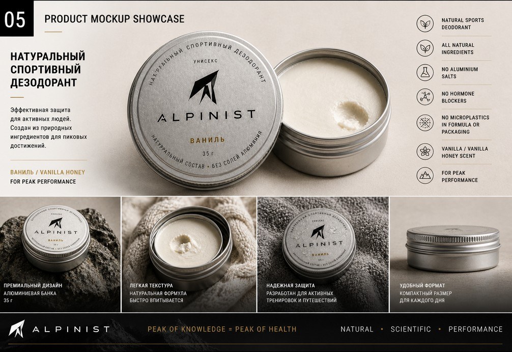
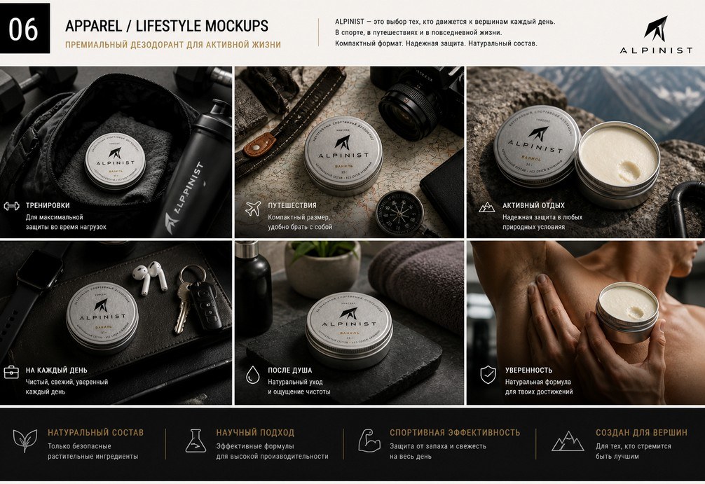
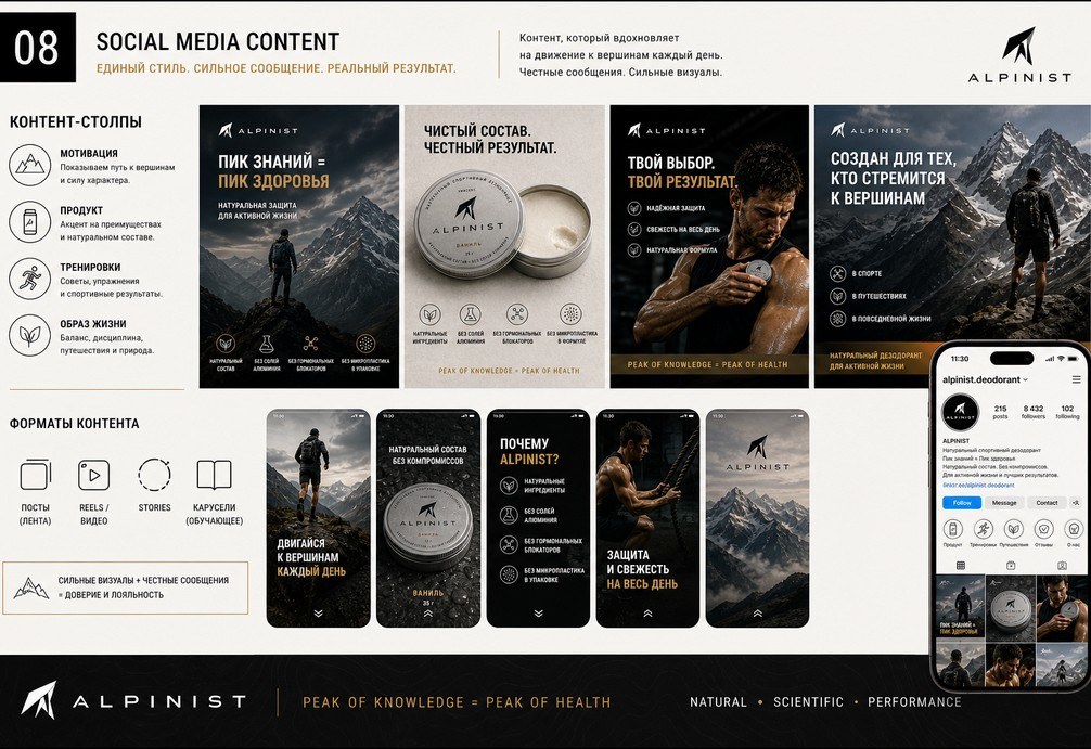
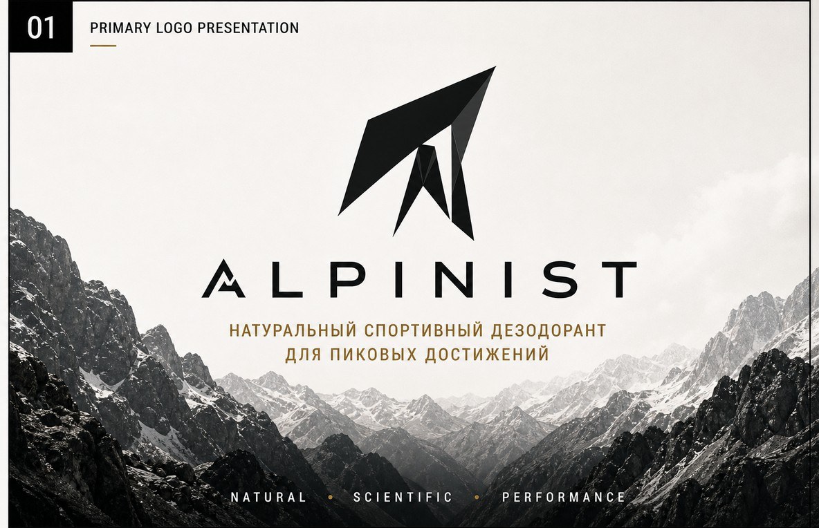
We built a complete brand system from zero: the primary logo and identity, product packaging, apparel, and a social content style — so every touchpoint looked like it belonged to the same premium brand.
Nothing was designed in isolation. The logo informed the packaging, the packaging informed the product photography, and the photography informed how the feed looks. One decision cascades through everything.
A system, not just a logo
The difference between a logo and a brand is repeatability. We handed over the rules — how the product is shot, how the founder shows up, how a post is laid out — so the brand stays consistent no matter who makes the next asset.
That is what lets a small brand look big: consistency across every touchpoint, on a budget, without a full in-house team.
The result
Alpinist now looks as premium as it performs — retail-ready on the shelf and credible to a paid audience. The brand finally makes the case the product always deserved.